05PERSONAL SITE / DESIGN & BUILD
KENLIN.CC
A readable site bringing technology, photography and thought together, refined through AI-assisted design reviews.
2026
DESIGN PUBLICATION
01
The website itself is part of my work.
Bring the eye I developed through photography into my website.
I wanted one place for my photographs, technical projects and personal introduction. The site is more than a place to put projects; it is a project I want to make well.
I wanted more than a template with different text and images. I made the decisions about planning, structure, visuals, implementation and publishing, and worked with AI to build them.
Bring the eye I developed through photography into my website.
Photography
Technology
Introduction
The website itself is part of my work.
02
Organize the content before choosing the structure.
One navigation structure for JP, Chinese and EN.
I first sorted the work, journal, photography, about and contact content, then gave each a clear entry. Japanese uses /, Chinese /zh and English /en, while language switching keeps the reader on the same page.
While deciding the structure, AI suggested separate Spring Boot and Vue applications. After understanding how Next.js works with Vercel, I chose Next.js for this content-focused site. I checked the reasons before accepting any suggestion.
ROUTE SYSTEM
JP / · 中文 /zh · EN /enHome
Work
Journal
Photography
About
Contact
THREE LANGUAGESJP / · 中文 /zh · EN /en
JP /, Chinese /zh and EN /en: three languages, six site sections.
03
Find my visual direction through photos, type and fine rules.
A magazine-like feel that remains easy to read.
The initial AI cover had an industrial feel I did not like. I brought in my own ideas and photographs, rendered previews and refined them. The direction moved toward photographs, paper texture and space.
Mincho headlines set the tone while body text stays legible. Vermilion marks key points and green rules connect flows. Wide screens use columns; phones keep the same reading sequence vertically.
VISUAL LEDGER
What we wanted / What we chose01
Photography and paper
Bring photography and technology together with a calm reading surface.
02
Type and emphasis
Mincho headlines, legible prose and meaningful color.
03
Reading on phones
Keep images and paragraphs in order, with keyboard navigation.
04
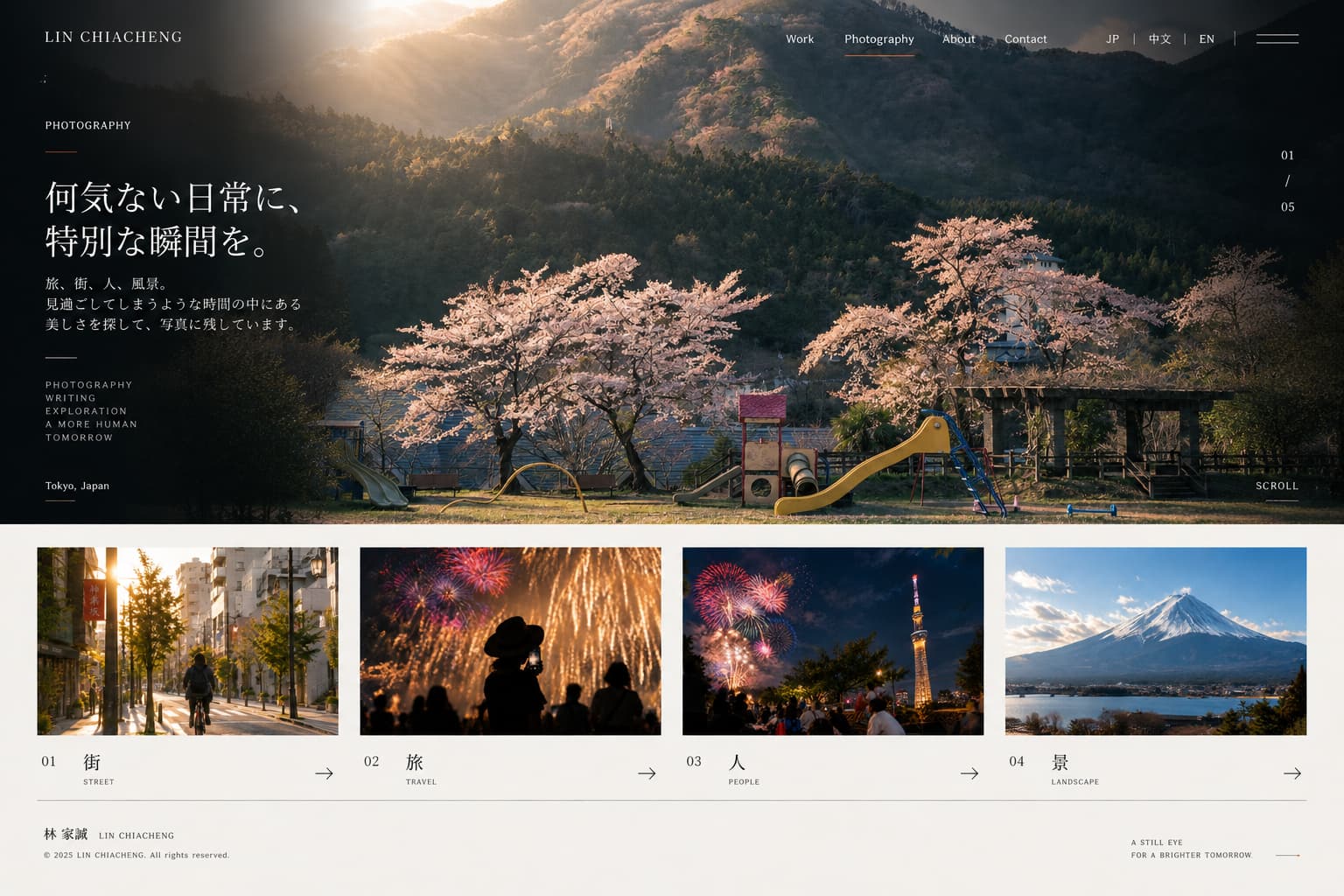
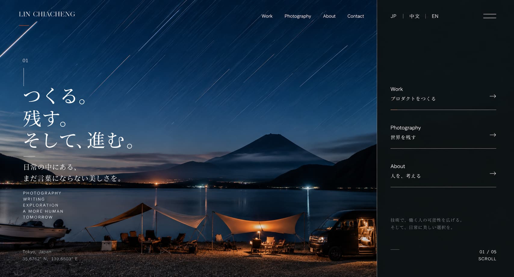
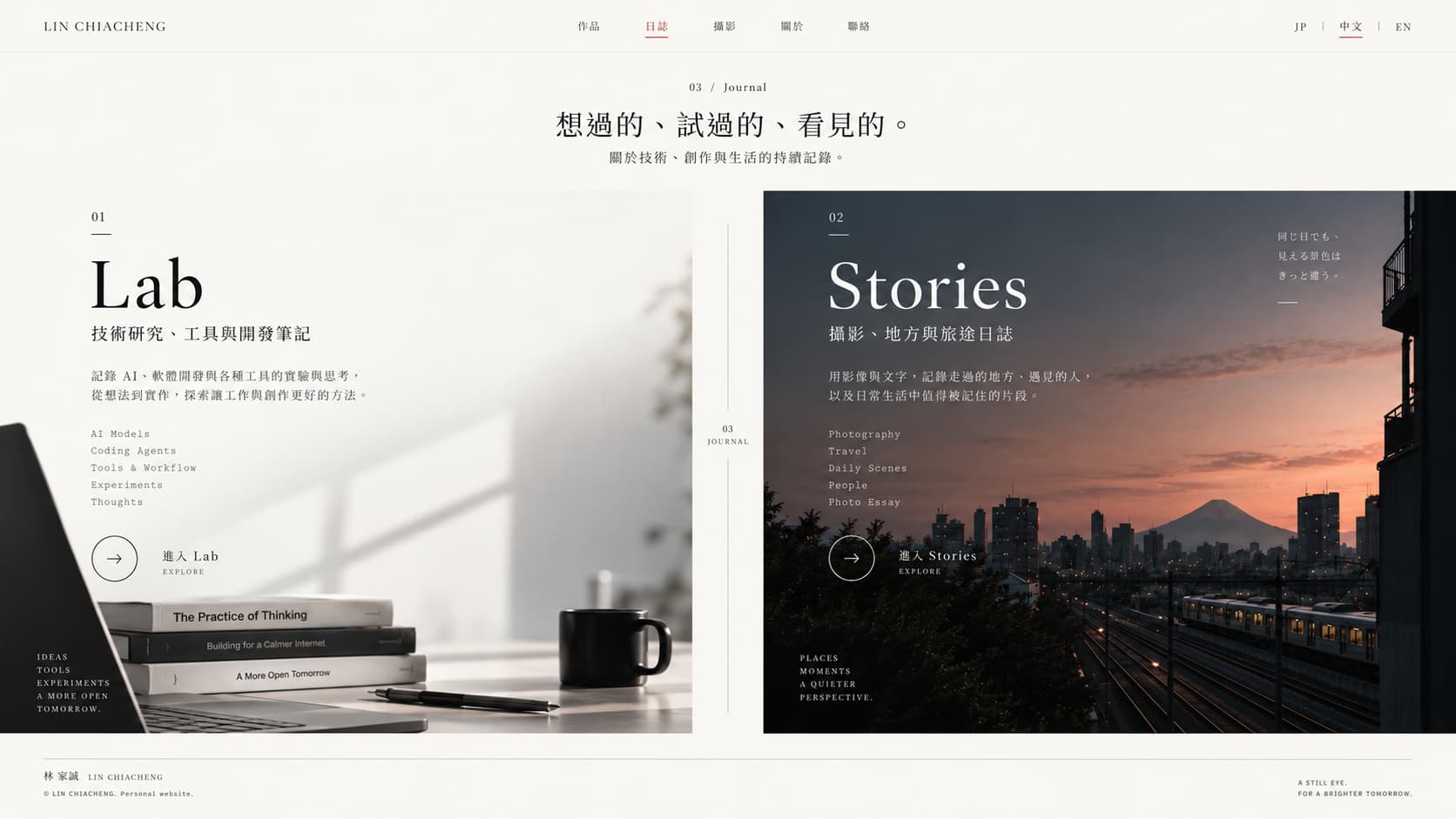
It took four versions to get closer to what I wanted.
Too ordinary, too much like a photo album, too much like a template.
Version one was too ordinary, version two felt like a photo album, and version three looked too much like a template. Version four brought photography, technical work and my introduction into better balance.
VERSION LINE
V1 / V2 / V3 / V4- 01
V1
Ordinary
The first site felt too ordinary.
- 02
V2
Photo album
The photo-album direction overshadowed technical work.
- 03
V3
Template
The template-like direction lacked my own character.
- 04
V4
Current direction
Balance photography, technical work and my introduction.
My review of each direction; the images below are retained design previews.
05
Build with AI; decide the direction myself.
Discuss, preview and check the real page.
Much of the frontend was built with AI. I explain what I want, choose tools suited to each task and check whether the actual page matches that direction.
Rendered previews help, but I still need to inspect the website itself. Requirements, technology choices and design decisions remain mine. The detailed collaboration process is covered in the AI workflow case.
SITE LOG
DISCUSS / PREVIEW / CHECK- 01DISCUSS
Discuss
Explain the requirements and reference direction.
- 02PREVIEW
Preview
Review rendered previews, then refine design and implementation.
- 03CHECK
Check
Check reading and interaction on the real page.
Use previews to discuss the direction and the real site to check the result.
06
Turn the site I imagined into a site people can use.
Current
01
One entry for photography, technical work and my introduction.
I will keep refining the site. Each change should make projects easier to understand and articles easier to read, rather than simply adding layouts.
Current
KENLIN / 06One entry for photography, technical work and my introduction.